Take your car in for a hundred-point inspection and you get a sheet back. Ninety-six lines say “pass.” Four say something else. You read the four, obviously. But you trust them because of the ninety-six. You can see that the shop looked, and exactly what it looked at.
That is what Runwise sells for buildings. We monitor heating systems and tell operators something is wrong before their tenants do. About forty-five checks run on every building. The alerts page showed only the ones that failed.
On a good day, it showed nothing. The screen that was supposed to prove the monitoring worked went blank precisely when it did.
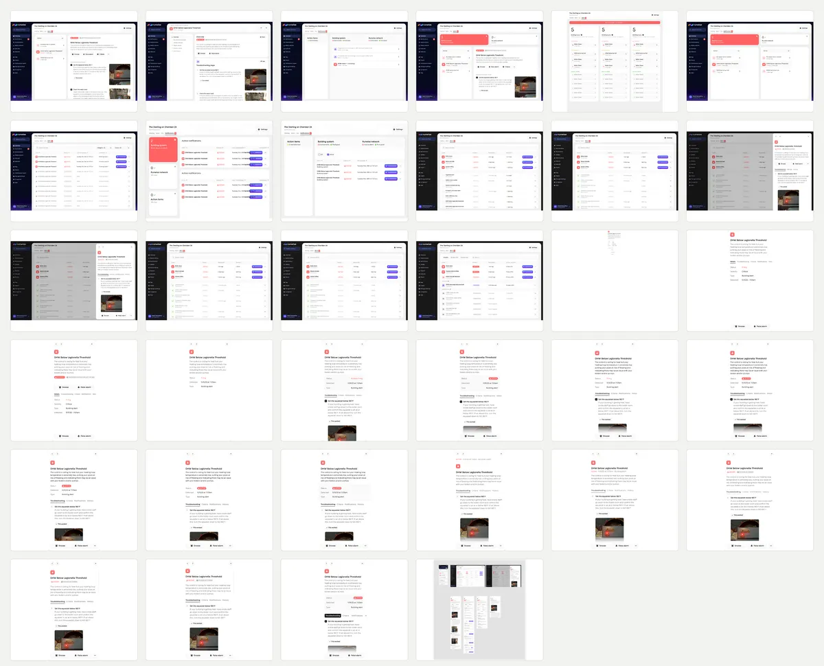
The final design is a table. The interesting part is the four months it took to make that table obvious: support tickets, thirty-four versions of the same screen, and a surprisingly difficult question — what should the product say when nothing is wrong?
I was replacing my own work
I designed the split-panel alerts tab in 2023 and I argued for it at the time. Alerts on the left, the selected one expanded on the right, section headers you could scan. I wrote a whole post comparing it against the alternative and the sentence I used was “it allows users to scan through the entire alerts tab without drawing too much attention to any particular element.”
That was true then and it is still true. The layout was never the problem. The problem was what the layout was allowed to contain, and I didn’t see it for two years.
What made me see it was a support conversation. Clodel, one of our customer success people, was running an in-person app refresher, and the thing that got the room’s attention was not the alerts. It was a small link called View alert descriptions — a static, hardcoded page listing what Runwise watches for. Shawn Hoffman noticed and dropped it in the product channel.
People wanted the ninety-six lines. We had hidden them on a page nobody maintained while putting all our attention on the four.
The support queue knew first
In August, Shawn synthesized roughly two hundred support threads from a single week. His last line contained the whole project:
Nearly every ticket this week is a customer telling us something about their building our system should already have known — that it’s summer, that work is scheduled, that they sold it, that the super changed, that the leak was checked and was nothing.
Underneath that were the specifics. Gas-leak alerts fired about twenty-five times that week as CRITICAL, across ten buildings, and every single one auto-resolved as “no longer detected” with zero confirmed leaks. One sensor had fired more than twenty times since mid-June. A return-line alert at another building had fired thirteen times since October 2024, in a boiler room the customer had already told us was in summer mode.
The alerts were mostly doing what they were built to do. The product simply had no memory for what the customer already knew. There was no “planned work” state, no record that somebody had investigated a leak, and no sign that the same sensor had cried wolf twenty times.
Better detection would solve part of this. But showing the history, exposing the trigger criteria, and letting a customer mute the noise would solve something too. That part was a design problem.
The first idea was obvious and wrong
The first move was obvious and wrong. We now had categories — building alerts, network alerts, action items — so I built a switcher. Big buckets across the top, pick one, see everything in it underneath.
It looked good. It also made you click three times and remember three screens to answer one question: is anything wrong? The categories were our filing system, not the customer’s mental model.
Max McCafferty, the PM on this, killed the version I liked most. I had three coloured summary cards sitting above the list, each with a big number in it. Later, on the sibling component, Shawn found the sentence for what was wrong with that shape: the top alert didn’t feel connected to the counts underneath it, like seeing one email when your inbox says forty-seven unread. Lee Hoffman was blunter: “it’s a lot and complex to look at. I like the alerts below.”
Honestly, I still think those cards were good. They died because the list under them was better and there wasn’t room for both.
The green check mark meant the wrong thing
If you’re going to show people the things that aren’t firing, you have to mark them somehow. My first instinct was a green check. Firing things get the warning triangle, quiet things get a check, the page reads as mostly-fine at a glance. I built it and put it in front of people.
It failed in two separate rooms in the same week. Shawn tested it at home with his wife and friends and came back with the same note twice: the greyed-out rows read as resolved, not as being watched. Then the whole company saw it at the design feedback forum and the notes included “green checkmark meaning unclear, especially re: auto-resolve vs. manual resolve” and, one line up, that the word Normal was confusing too.
Technically, the alert was resolved. The icon was answering a question about the past when the row needed to say something about the present.
A check mark is a receipt. I needed a verb. That is where the eye icon came from, and why the third state became Monitoring instead of Normal, OK, or Healthy. Those are grades. Monitoring is work still in progress.
One row, two conflicting truths
The other thing that had to collapse was severity. The table started with a Status column and a Severity column, which sounds reasonable until you look at a row that says Normal · Critical and try to say out loud what it means.
It means the alert is not firing and would be serious if it did. Which is a real fact about the world and a terrible thing to put in a table, because the eye reads the red word and not the grey one. We tried taking the colour dot off the severity column so it wouldn’t pull — that helped, and it also proved the column was decoration.
So severity folded into status, and status grew from two values to four. Each one says what is true right now.
Why a table won
A table is not the most exciting artifact in the file. It is the one that survives the library doubling.
There are about forty-five checks today and the plan is to pass a hundred. A card layout that reads beautifully at nine rows becomes a scroll you’ll never reach the bottom of at a hundred, and cards can’t sort, filter, or be scanned down a single column. A table can. Sometimes the boring answer is the durable one.
The column that changed an event into a pattern
The column I’m proudest of sits quietly on the right. It shows how many of the last sixty days an alert was active, as a count and a percentage.
I did not think of it. It came out of that same design feedback forum, where somebody asked for historical alert data in the main table — the example they used was “twelve boiler-down alerts in two months.” It turned out the backend had been tracking retrigger count and last retrigger time the whole time. Nobody had ever put it on a screen.
It matters because each firing from that gas sensor looked like a new event. Put 21 days (35%) beside it and the event becomes a pattern. That is what you need to see before you change its criteria or call somebody.
Kaitlyn Rhodes, on support, immediately flagged the limit of it: for an alert like a return line leak, which re-triggers constantly by design, a raw count misleads. She’s right, and I shipped the column anyway, because the alternative is that nobody sees the pattern at all. Sixty is a guess too — long enough to cover a cold snap, short enough that last winter doesn’t drag the number.
The data killed my best-looking screen
Clicking a row had to go somewhere, and the obvious answer was a page. I designed it — a proper alert page with a left submenu: overview, troubleshooting steps, general settings, trigger criteria, resolve criteria, alert history. It’s in the contact sheet above, second frame, and it is the best-looking thing in the file.
Lee asked for a design review. I brought usage data, and it killed my own page.
Over ninety days, seventy per cent of the people who engaged with an alert got there from an alert card somewhere else in the app — 1,509 of them — and only thirty per cent came in through the alerts tab. Ninety-three per cent of sessions looked at exactly one alert. Sessions with three or more were under one per cent. And seventy-three per cent of alert detail views happened on a phone.
The typical user was on a phone, arrived from a link, read one alert, and left. A dedicated page erased their context. A side sheet kept the table underneath and made closing the alert feel like returning, not navigating again.
It also gave us something reusable. Max’s note was that side sheets could become a pattern — trigger one from anywhere an alert appears, no navigation anywhere.
The header went through more rounds than anything else on the page. Status, detected-at, and type are three facts nobody scrolls for and everybody wants immediately, and the file contains a labelled table for them, the same table unboxed, an eyebrow above the title, a subtitle under it, and finally two chips.
Chips won on height. Three labelled rows cost ninety-six pixels and pushed the tab row below the fold, and a tab row you can’t see is a set of features that don’t exist. Two chips cost twenty.
Four tabs became three in one sentence
The sheet you’re looking at has four tabs: Troubleshooting, Criteria, Notifications, History. It shipped with three.
Max left one note: collapse Criteria and Notifications into a single Settings tab. Two people agreed within the hour. Both tabs answered the same question — why does this fire, and who hears about it? — and splitting them made people guess where the answer lived.
I’ve left the four-tab version standing in the figure above because that’s the frame, and pretending otherwise would make the file agree with the story a little too neatly.
I lost the same argument twice
Where the Snooze and False alarm buttons go is the one thing on this page that never really settled.
In July the position was: bury them. Put them under the three-dot menu, because a page about making an alert go away is the wrong page — it should be about fixing the thing the alert is pointing at. I agreed and drew it that way.
In August, looking at the same modal, Max wrote: “the buttons to deal with the alert need to be in the header.” Which is also right. If you’ve arrived from an email at seven in the morning and you already know this one is noise, making you scroll past four troubleshooting steps to silence it is a small cruelty.
What shipped is neither. A bar pins both actions to the bottom of the sheet, keeping them visible without making them the first thing you read. It is a compromise, not a grand synthesis. It will probably move again once we watch someone use it during a cold snap.
The state only engineering could see
One more reason the Snoozed tier is its own band rather than a filter.
On the newer alert system an alert could be silenced until a date, and the backend recorded all of it — who did it, when, until when. The front end surfaced none of it. In August a support engineer put it plainly in the feedback channel:
There is an ignore feature for alerts that only gets sent out to customers, we cannot see it. When a customer selects ignore it can only be identified by Engineering on the backend. It is not in the app for us to see.
A customer could ask why an alert never arrived, and nothing in the product could answer. Support had to ask an engineer to inspect the backend and discover that somebody had silenced it weeks earlier.
That’s the History tab, and it’s why the timeline names the person: “Alert snoozed — Mekael Wesley-Rosa snoozed this alert Tuesday Nov 11th.” Making state visible is unglamorous and it removes a whole class of ticket.
The things we chose not to build
First: no green. There is red for firing, purple for snoozed, and grey for monitoring. A page full of green reassurance would only make the red warnings work harder for attention.
The Monitoring rows are grey, and grey is doing something specific here: it says present, not urgent. They’re legible, they’re sortable, they’re clickable, and they will never be the first thing your eye lands on. That’s the correct amount of attention for a check that passed.
I also turned down a button. Joe Pak asked for an alert-level “yes, this was a real issue, I fixed it” action, so we could score how often our detection was right. Good reason — you can’t tune a threshold you can’t measure. But we already have False alarm, and adding its mirror gives the user two similar buttons to distinguish under stress in a boiler room. Joe agreed it wasn’t urgent and floated doing the labelling internally instead. If the measurement turns out to matter more than I think, that’s the decision to revisit first.
And I dropped the banner across the top of the page. It was a red bar that said Boiler down · 32 mins ago and it was genuinely useful, and it duplicated row one of the table two inches below it.
One decision was mostly taste
Rows are separated by a hairline rather than by a filled bar. We had both and I went with the line, and when Max asked why, the best I had was that the bars made the table look like it was full of buttons.
I still don’t have a better reason. Not every decision has a research finding behind it; sometimes one version simply feels quieter. If somebody rebuilds it the other way, I probably won’t notice.
What happens next
The alerts page went to development on 13 August 2026. Alerts V2, the detection system underneath it, is rolling out behind a feature flag — not every building is on it yet, and it was still throwing memory errors on some checks in late August. The alerts and action items component on the building page was approved at the end of August and is due to land before the heating season.
The biggest open question is the premise of the whole page. Five Monitoring rows feel reassuring. A hundred may feel like a wall of grey. If that happens, the answer is probably grouping rather than hiding. I would rather solve that with a hundred real rows in front of me than optimize for an imaginary problem now.
There is also a number I cannot give you yet. Nobody has used the new page, so there is no before-and-after for ticket volume and no evidence that people will open it when nothing is wrong. That is the result that would tell us whether the hundred-point inspection was more than a good metaphor.
Role: Product design · Collaborators: Max McCafferty (product), Joe Pak (product), Sulaiman Hamouda and Michael Bond (engineering), Shawn Hoffman and Lee Hoffman (product review), Kaitlyn Rhodes and the support team, who supplied every good example in here · The three cards this page sits under are their own story, over on building health