The project I talked us out of
This one waits for the guestbook. Leave your name and email and it opens.
Still shut after that? Email me and I’ll send it another way.
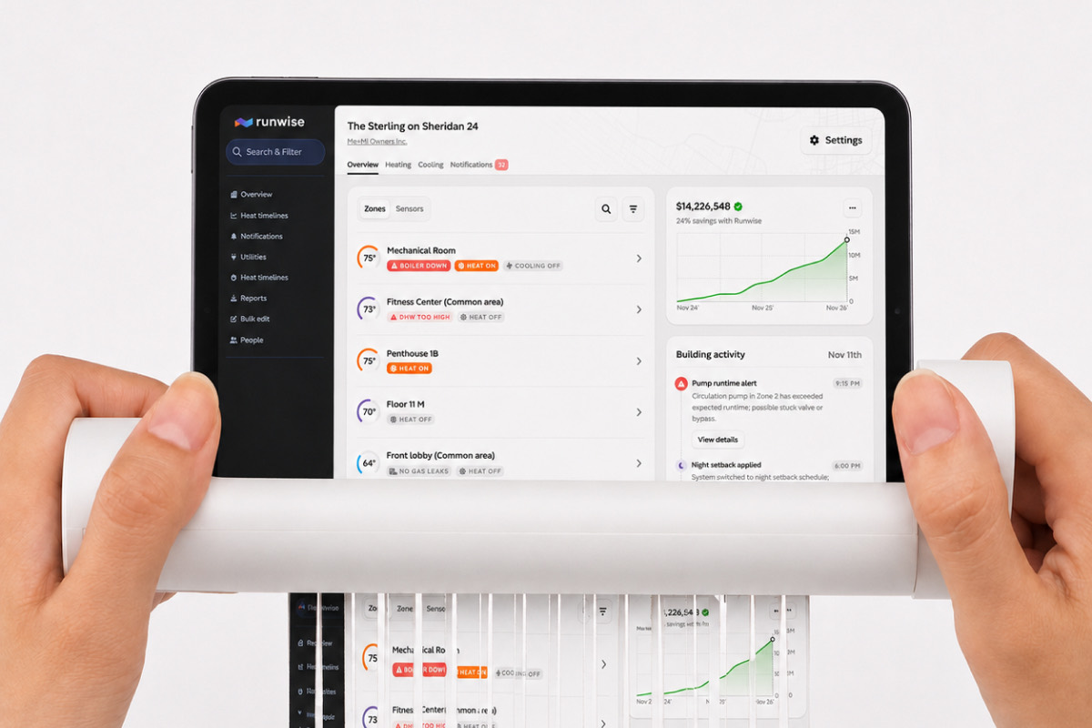
Some apartment buildings split their heating systems into zones. Our software treated every zone like its own building, so one property could turn into four unrelated pages.
I spent nine months designing a better version. I still think the screens were good. Then I asked one question I should have asked in week one.
One building, four pages
I led the research, designed the feature, asked for the usage data, and made the case for changing direction. I did not cancel the project myself. Our head of product made that call. My job was to bring him a better argument than the one we had started with.
A heating zone is one section of a building with its own radiators. One floor can be freezing while the rest of the property is comfortable, so the zones need to be monitored separately.
Separate did not have to mean unrelated, but that was how our product worked. A manager with a four-zone property had to open four building pages and piece the property back together in their head. I had seen it happen, so when I was asked to fix it, the project felt obvious.
The clue was right there
I talked with coworkers and a property manager who handled multi-zone buildings every day. I kept the questions simple:
- What is your checklist when you look at a zone?
- What do you want to know first?
- With a hundred zones, how do you pick which one to open?
His answers led to an overview, faster navigation, and better statistics for each zone. People liked the work. I still think the screens were good.
But he also did something I wrote down and failed to understand. He got an alert for Zone 2, then immediately checked the temperatures in the other three zones. He was not trying to manage one zone. He was trying to understand the whole building.
By then I had spent months thinking in pages, so I treated the moment like a useful detail instead of what it really was: a challenge to the entire premise.
One physical building became four product pages
The software lost the building.
Why every version got harder
I was quietly designing for two different jobs. One person needed to compare four zones inside a single building. Another needed to scan a hundred buildings and find the few that needed attention.
One screen never felt natural for both. Worse, I could not answer a basic navigation question: if someone selected the whole building instead of a zone, where would we take them?
The screens were approved anyway. We had agreed on what the screens should look like without agreeing on how the feature should work.
Two jobs, one screen that never fit both
Ninety days of platform activity, and multi-zone’s share of it
The one request that changed the project
Nine months in, I finally asked our data team how people used the existing feature. The previous ninety days looked like this:
- Only 100 of 4,699 users had opened it.
- Thirty-nine of them opened it once and never returned.
- It appeared in 498 of 334,512 sessions.
The need was real. The audience was much smaller than I had assumed.
And yes, nine months is an absurdly long time to wait before asking.
The first comparison was not entirely fair. Most buildings do not have zones, so comparing zone activity with all platform activity makes the feature look smaller than it is. I checked that too. We had 123 active multi-zone buildings out of more than ten thousand. Seventy percent of them had exactly two zones and ninety percent had four or fewer. The hundred-zone property driving my design was almost hypothetical.
The feature was rare. The extreme case was rarer.
The problem was bigger than zones
I went back through my interview notes. People had not been asking only for better zone pages. They kept saying some version of “I can’t see everything I care about in one place.”
They wanted all their nursing homes together. Or their schools. Or the handful of accounts they checked every morning.
Zones were one instance of a much broader need. I had spent nine months making the narrowest version of it really nice.
Groups, not just zones
Instead of building a special page for zones, I proposed letting customers group any buildings they cared about. Schools, nursing homes, a campus, or the four zones of one property—the product did not need to know why they belonged together.
Before taking that argument to the product team, I brought the numbers to Kelly-Ann in support. She helped me separate what was merely annoying from what customers actually needed. Then I made the case:
Fewer than 5% of our buildings use multiple zones. Letting customers group buildings would help everyone organize the properties they care about. I think we should build groups first.
Our product manager agreed. Customers had already been asking for better organization and bulk editing, not simply faster movement between zone pages. He called groups 95% of the benefit for 5% of the work.
Then an engineer pointed out another use I had missed: a customer could put an entire campus in one place. The broader idea kept getting broader.
What the 95/5 claim said, and what we could verify
Then engineering pushed back
Our engineering lead challenged the premise behind my proposal:
The percent of our buildings with zones is low because we don’t support zones well.
He was right. Low usage did not necessarily mean low demand. Our product handled zones poorly. The numbers measured the limits of the product as much as they measured customer interest.
He also found market data suggesting complex heating systems were far more common than our customer base made them look. We might have been missing thousands of buildings precisely because the product was not designed for them.
Another engineer named everything Groups would not fix. Underneath, every zone would still be a building. Savings would still be confused. Settings would still be duplicated. Some building-wide alerts would still reach only one zone.
Both engineers were right. I did not have a rebuttal, so I did not make one up.
Complex heating in the market, compared with Runwise
The smallest known code footprint of each option
We were arguing about the wrong thing
We had framed the discussion as a choice. Either zones mattered or Groups did. Keep going or cancel the work.
But the evidence did not support either answer. Usage was tiny, the broader organizational need was real, and the underlying zone model was still broken.
The real decision was which problem to solve first.
I proposed a sequence:
First, let customers group buildings however they choose. Then tackle the deeper work of treating several zones as one building.
Our engineering lead agreed. That was the turn.
The disagreement was not about whether zones mattered. It was about order.
From either-or to what-firstOnce we changed the question, nobody had to pretend one problem was unimportant. We only had to decide what came first.
What we built first
Portfolio Groups lets customers choose any buildings, give the group a name, and manage them together. One savings view. One sensor list. One place to edit several buildings at once.
A four-zone property could now become one group with four members. It did not fix the data model, but it was much better than four unrelated pages. The original request survived inside the broader feature.
That is what made the sequence useful instead of evasive. We were not using Groups to avoid the hard problem. We were solving the broader problem first.
The evidence changed the question from either-or to what-first
Both problems were real. The decision was their order.
The work did not disappear
We paused the dedicated multi-zone feature. Portfolio Groups shipped a few months later, and customers started using it. The statistics I had designed for zones moved into the grouped views. The work was redirected, not discarded.
Groups eventually became a larger project than the zone pages would have been. I did not talk the team out of doing work. I helped point the work at a problem more customers had, while keeping proper zone support in the plan.
The question belonged in week one
The usage data took one request to get. I waited nine months to make it.
Spending nine months on designs that never shipped was not the mistake. Waiting nine months to test the assumption underneath them was.
I still believe proper zone support matters. The evidence never disproved that. It gave us something more useful: an order of operations.
Nine months of design, then one week that changed the direction
The bigger picture
What I want you to take from this is not that I talked us out of work. I helped point the work at a problem more customers had, while keeping proper zone support in the plan.
Spending nine months on designs that never shipped was not the mistake. Waiting nine months to test the assumption underneath them was. The usage data took one request to get.
I still believe proper zone support matters. The evidence never disproved that. It gave us something more useful: an order of operations.