It’s hard to believe how much of this project came down to agreeing on words. The radios were already being designed. The mesh was already going to use fewer relays and last longer on a battery. What I walked into was a quieter problem: two people looking at the same sensor, from two different places, and coming away with two different answers.
There’s a specific kind of support ticket that used to come in after an install. The dashboard said a sensor was missing. The technician who had just mounted it was standing next to it, watching a light. Both of them were reporting what they saw, and they were both right. An engineer would then have to open the logs and decide which of them was looking at the real answer.
That’s expensive. Not because the investigation is hard — usually it isn’t — but because it turns a routine installation question into a third person’s afternoon.
If I had to pick the single highest-leverage thing I did here, it wasn’t a screen. It was sitting down with the firmware team and writing down what every status meant, before either interface existed. Then I designed two expressions of that list: a dashboard for the office, and a blinking light for the basement.
How a reading actually travels
A temperature sensor in an apartment does not talk to Runwise. Its reading hops through battery-powered relays until it reaches a control box in the basement, then leaves the building over a cellular connection. The relays have to run for years without being plugged in or regularly maintained.
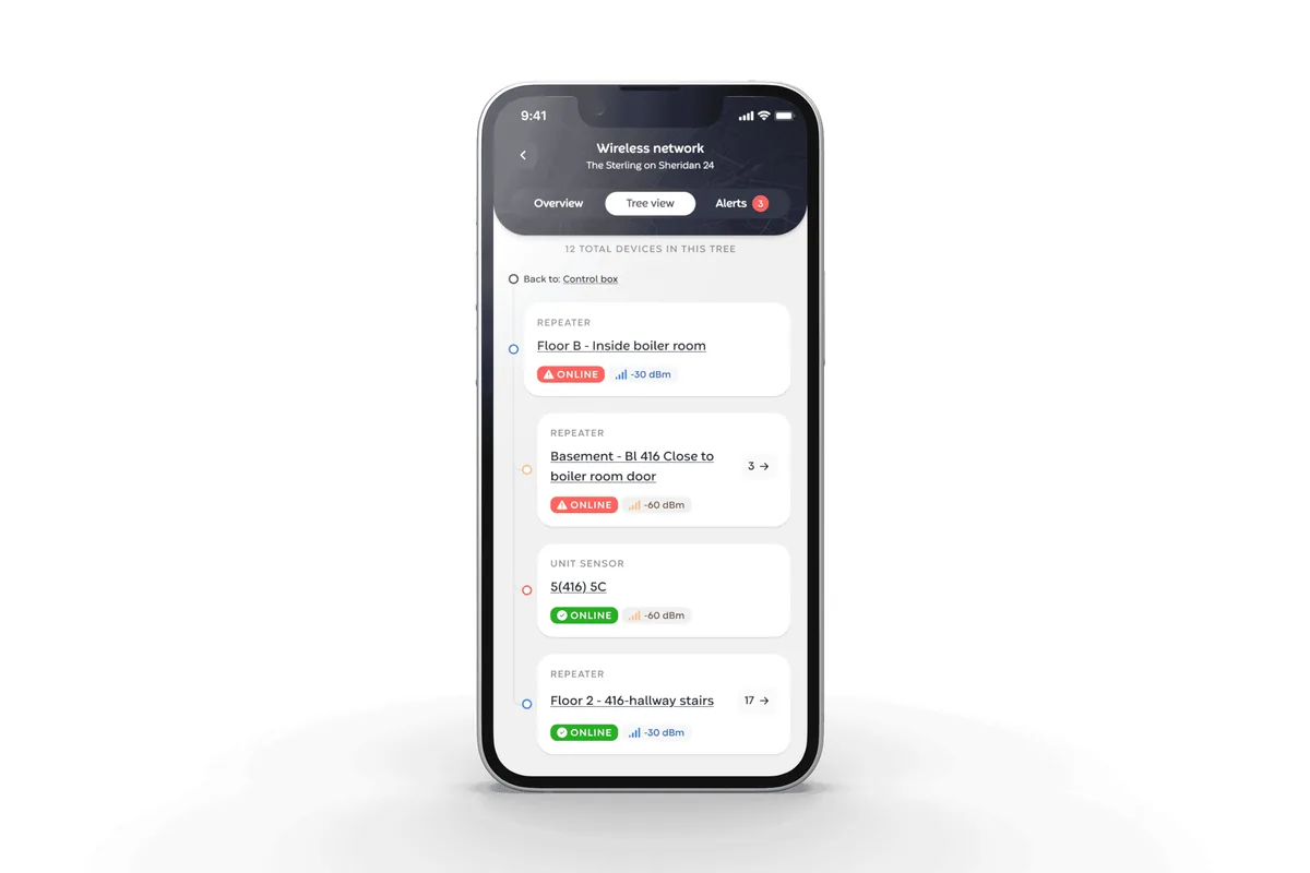
When one dies, it does not announce itself. Everything behind it simply goes quiet. Six apartments can stop reporting at the same moment even though none of their sensors is broken. A flat list presents six red rows. The actual problem is one relay.
The radios were already being designed
I designed the network screens and the behavior of the lights on the devices. I also wrote front-end code for parts of the dashboard, and I worked with the firmware team on the status list before either of us built anything.
And to be clear: I did not design the radio system, the battery behavior, or the hardware. The Gen 2 network uses more than 50% fewer relays than the old system and gets roughly twice the battery life of competing mesh networks. Those are firmware and hardware wins. My work was making that network understandable when it stopped behaving as expected.
A parts list is not a diagnosis
If I had to name the least glamorous, most useful decision in the dashboard, it would be the order of the list.
I ordered devices by how the signal travels through them, not by device type. The control box sits at the top. Relays sit under the device they report through. Sensors sit under their relay. This sounds obvious after you see it. It was not how the information had been organized. A list of every relay and then every sensor is a useful inventory. It hides the relationship that explains the failure.
Each row also carried the signal strength, its route home, and the share of messages that arrived. On a phone, the page focused on one relay and its history. The useful question was rarely “is this bad?” It was “is this worse than last week?”
The three-second interface
None of that dashboard helps someone standing on a ladder in a stairwell. The device interface had one button and one light.
Before mounting a sensor, the technician pressed the button. The light answered with the signal strength at that exact spot. They could mount it there or move until the signal improved.
Press. Look. Mount.
A signal check took about three secondsI love that this is how the field work started. Nobody puts a three-second signal check on a roadmap. But a technician could finish the job, drive away, and discover weeks later that the sensor never had a reliable route home. Fixing it meant another truck visit, often costing more than the original installation. A weak connection also made the device retry constantly and shortened its battery life.
We used both color and blink rhythm for the four network states so the light could be read at arm’s length in a dark basement. Field operations and I printed the mappings on cards for the trucks. Che, one of the technicians, is why we laminated them.
A card in a glovebox gets read. A help page does not.
Hundreds of little decisions
People always ask how you make a system like this understandable. My answer is the same as it is for anything else: hundreds of little decisions done right.
Showing a raw radio reading was not enough. A technician needed to know whether −67 dBm was good enough to mount, and that answer depended on the firmware generation. Older nodes called anything up to a magnitude of 50 good. Firmware V1.3.8 and newer extended that ceiling to 67. Two devices one floor apart could therefore show the same number with different labels. That distinction belonged in the shared model, not in somebody’s memory.
“Offline” is not one timer either. A unit sensor can stay quiet four times as long as the default device before the product marks it offline. Applying the default to it would mark healthy devices as missing.
Any one of three timestamps resets the clock: the optimal path through the mesh, a message carrying signal strength, or an actual data message such as a temperature. A device can be reporting a path while sending no data, or sending data over a path nobody would choose. Any one of the three means the radio is alive, so requiring the expected one would mark healthy devices offline for being healthy in an unexpected way.
One model, four surfaces
“Connected” had to mean the same thing on the hardware, in the tree, on the device row, and in its history. We agreed on the states with the firmware team first, then let each interface express them in the form its setting allowed.
The dashboard could use words, history, and a diagram. The hardware had a light. Different vocabulary would have been easy to design and expensive to support. I have used the same approach on every product since that needs to show one system through several interfaces.
The window still closed
The shared language removed one dependency on engineering, but not all of them. A technician had eight hours to complete an installation. If that window expired, an engineer had to restart it.
The field team also had to estimate how many relays a building needed before the network had enough history to guide them. The interface made placement less of a guess. It did not make planning automatic.
Two holes I left open
I want to be direct about two holes.
I did not test the signal colors with people who have color-vision differences. Many field technicians were men, which made this a particularly careless omission. The frustrating part is that the fix was already in the design. I had used blink rhythm as a second channel for network state and knew it worked. I did not use the same redundancy for signal quality, and I do not have a good reason.
I knew color needed a second channel. I shipped the signal check without one anyway.
No color-vision testing was performedYears later, reading the code, I found a second hole. On older hardware, a slot with no device assigned to it can report Online. The check returns true for the empty slot before it checks for a device, so the dashboard renders a green status for something that is not there.
This was the original problem pointing the other way. We started with a sensor that could exist in the building but not in the app. Here the app claimed a sensor existed when the slot was empty. Defining the words together made the interfaces agree. It did not guarantee that the words were true.
The product still stops one step early
Ordering devices by dependency made the cause visible, but it still asks a person to inspect the tree and find the shared parent. The product already knows the routes and timestamps. It should make the deduction too.
Relay 14 failed. Everything under it is affected.
That sentence is the unbuilt final rung. It is also a riskier promise: a named cause will be trusted more than a tree full of readings. The answer has to be right. But if the system knows enough to draw the dependency, it knows enough to attempt the diagnosis.
The bigger picture
What I want you to take from this is not that we made a nicer list. Two people used to look at the same sensor and come away with two different answers. We sat down with the firmware team, wrote down what every status meant, and then let each interface express that list in the form its setting allowed.
The shared status model now appears across a network running in more than 1,300 buildings. The network page was viewed 12,928 times in the last 30-day window I measured. Technicians can check a mounting location in about three seconds instead of discovering a weak connection after leaving the building.
The relay count and battery life still belong to the firmware and hardware teams. What I designed is how somebody understands and acts on the network they made possible.
We’re not done. The product still stops one step early. It can draw the tree. It still asks a person to find the failed parent. That sentence is still unbuilt: Relay 14 failed. Everything under it is affected.
- 1Shared statuses firstnot two vocabularies
- 2Dependency ordernot a parts list
- 3Color and blinknot color alone
- 4A check at the point of mountingnot after the truck leaves
- 5The product names the failed relaynever built
Role: Product design and front-end development · Collaborators: firmware, hardware, and field operations teams at Runwise · Che laminated the cards