Redesigning the whole app without turning it off
Nine parts of a heating-control app, rebuilt one at a time while thousands of apartment buildings kept running.
This one waits for the guestbook. Leave your name and email and it opens.
Still shut after that? Email me and I’ll send it another way.
Runwise hired me as its first product designer. The app controls heat in thousands of apartment buildings. If we broke the wrong thing in January, somebody did not just see an error page. Somebody got cold.
Over six months I rebuilt nine parts of it without interrupting a single building during heating season. The first design decision was not color, type, or layout. It was deciding what could change first.
This wasn’t a two-year redesign with a big reveal. Surfaces shipped continuously, as soon as they were ready. More on that in a minute.
The product worked. That was the constraint.
The old app was inconsistent, but it was not a failure. Real buildings stayed warm because of it. Each area had simply been designed at a different time by a different person, until the app looked less like one product and more like a record of everyone who had worked on it.
A superintendent still had to run the heat on Tuesday exactly as they had on Monday. We could not disappear for six months and come back with a grand reveal. The old and new products had to coexist, route by route, through heating season.
This made the redesign a sequencing problem before it was a visual one.
I was the only designer, working with a product manager, four engineers, and our CEO. That meant I owned the system, but not every good idea inside it. A formal design system came about a year later and was built by the broader team. This project was the earlier, messier work of finding the patterns that system would eventually need.
Start where every task starts
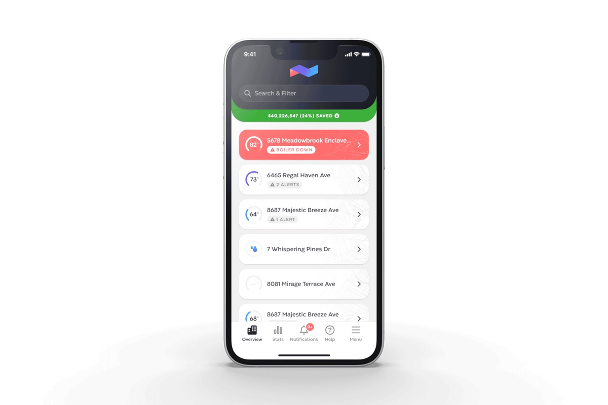
Almost every job began on the building overview. A manager opened it to investigate an alert, find a building, change a schedule, or begin using the app for the first time.
Whatever that page taught them, they carried into every screen after it. The other eight areas would inherit its structure. Get the overview wrong and I would redesign the rest twice.
The old page showed the same information twice. It ranked the buildings that needed attention, then repeated them in a second list. One building could appear in both with two different reasons to click it. People had to decide which list to trust.
That sounds like a small interface problem. It took longer to resolve than designing the next four areas combined.
We ended with one list. Every building appeared once, its state sat beside it, and the next action was obvious. That became the grammar for the rest of the app: show one state, then the action that changes it.
The empty page that produced a sale
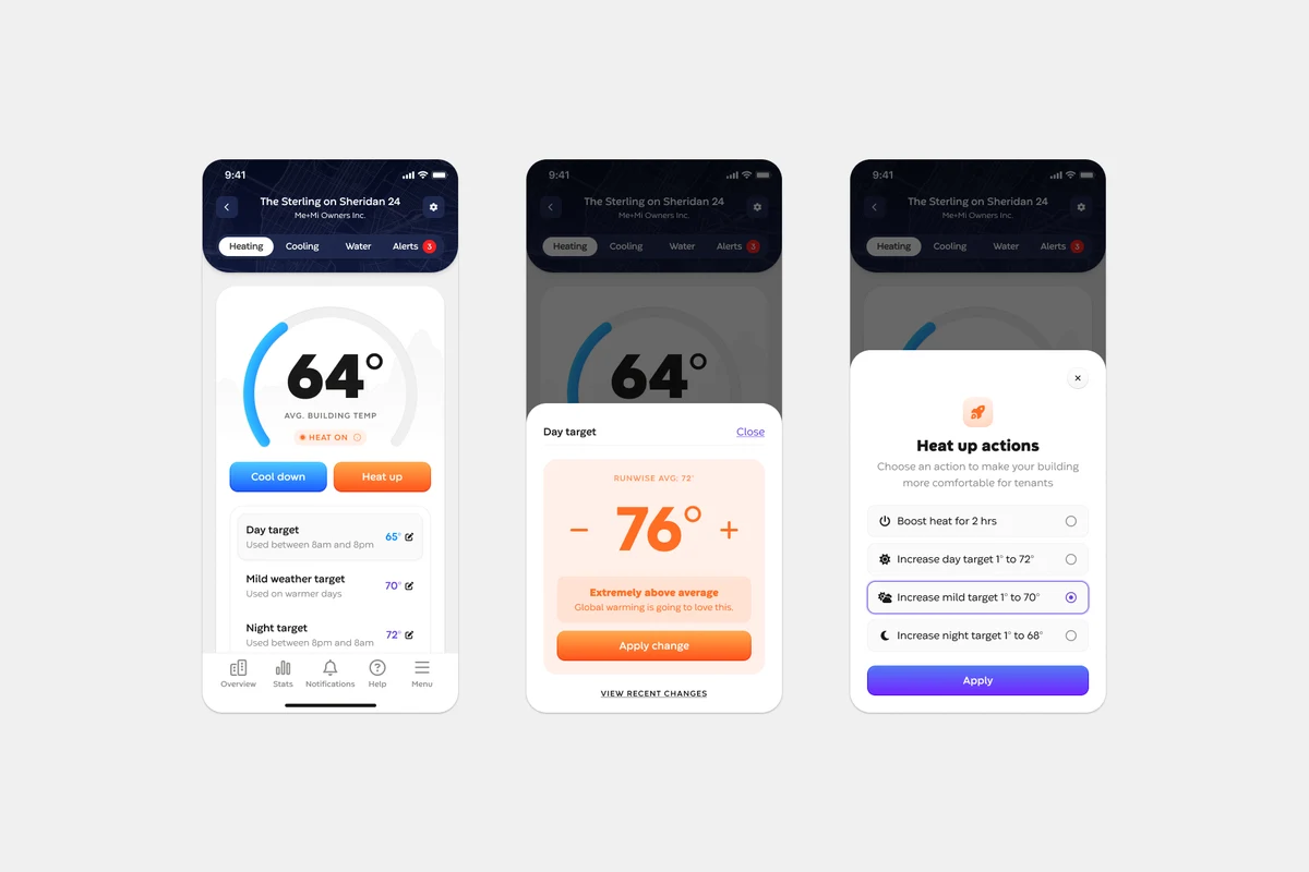
Most customers used Runwise for heating but not water monitoring. When they opened the water tab, they found a screen built for somebody else’s account. There was nothing to show.
The normal answer is a gray icon and “No data available.” It is honest, quick, and completely useless. It closes the conversation at the exact moment a customer has told you what they are curious about.
After nine rounds with engineering, the empty state explained what water monitoring would do for that building and gave the customer one clear way to ask about it. Three weeks after launch our head of product traced a closed deal back to a customer clicking that page.
We did not target anyone or send a campaign. The customer went looking for something they did not have. The page was ready when they arrived.
Put the work where everyone could argue with it
I had no design team to review the work. So I posted it in the company product channel, where the people who built, sold, installed, and supported the product could pull it apart.
- Lee, our CEO, argued with me about how charts behave when you touch them.
- Two engineers talked me out of my chart-hiding logic, and were right.
- Field staff told me what installers would hit before one hit it.
None of them reviewed like a designer, which was the point. They caught problems a design-only critique would have missed. I still work this way now that the company has formal design reviews.
Before each release we also taught the new behavior internally. If the support team cannot explain a redesign, it is not ready for the customer who calls them.
The part I got wrong
All nine shipped over six months with no interruption to any building. That was the hard requirement, and we met it.
I cannot tell you that the new screens made every task faster or easier. The product did not measure how people used each area before the redesign, and I did not add that measurement as I went. Shipping felt more urgent. I chose it every time.
That left us with no baseline. I can show that the overview now carries 37% of product pageviews, but not whether rebuilding it first made people better at their jobs. I might have been right. I might have been wrong and never known.
I now put measurement into the plan before the first design review, while there is still an old product left to measure.
What I can prove is narrower and still worth saying: nine areas changed while thousands of buildings stayed live through winter, with no interruption to their heat.
The bigger picture
What I want you to take from this is the pace. This wasn’t a two-year redesign with a big reveal. Surfaces shipped continuously, as soon as they were ready. We weren’t just making the app look like one product. We were changing the speed at which Runwise could ship without turning the heat off.
I now put measurement into the plan before the first design review, while there is still an old product left to measure. Shipping all nine areas without interrupting the heat was the achievement. Leaving no baseline behind was the hole in it.